top of page


Travel Time
UX | UI Project


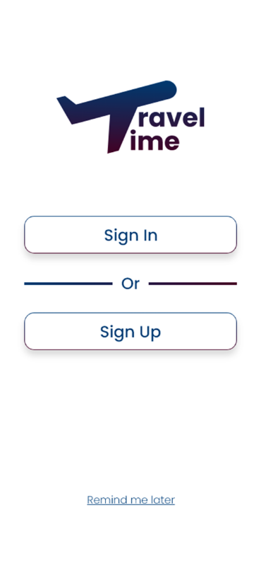
The Logo
The logo is my design. I tried to give the logo some subtext, by using the plane profile in the app name.
The Typography
I used Poppins typeface. It's very clean, reliable and easy to read typeface. The user will feel safe and trust to use and purchase with the app.
The Colors
The blue and purple colors communicate reliability and loyalty. The user have to feel those feelings for buying and planning his trip with the app.
Major traveling apps, as 'Booking' and 'Lonely Planet', are also using those colors as their main colors.
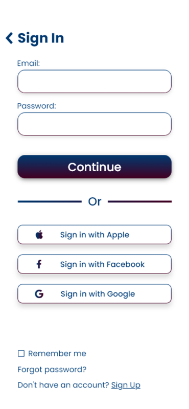
The Iconography
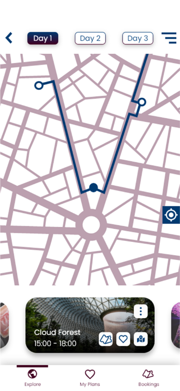
I designed the logo and the 'my location' icons.

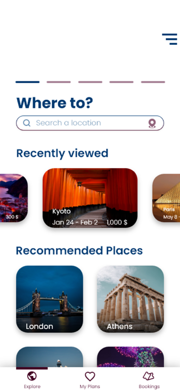
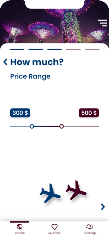
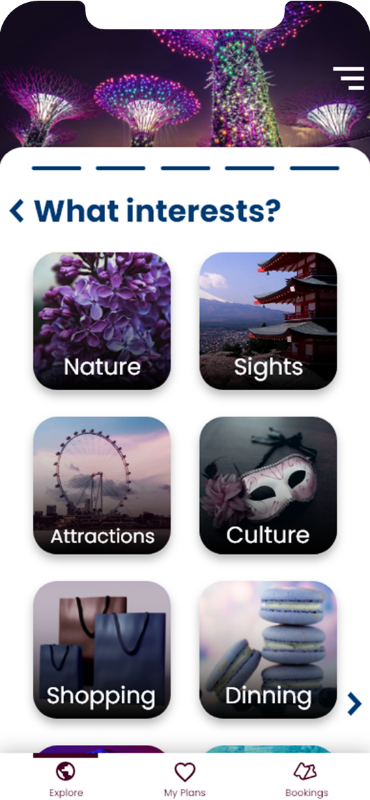
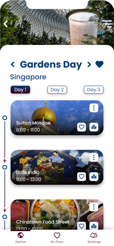
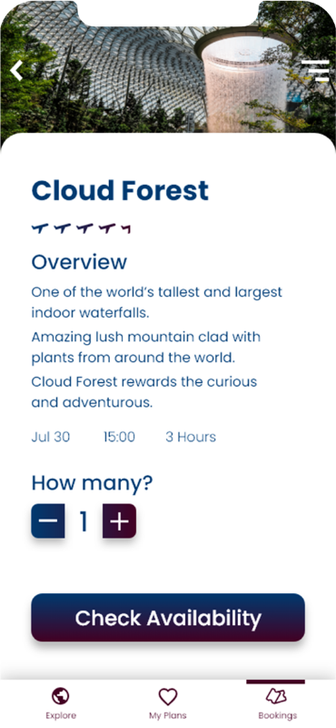
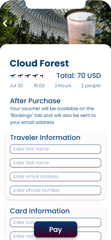
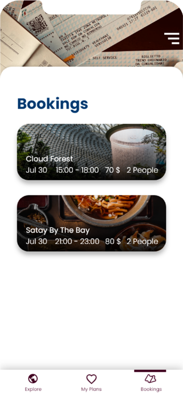
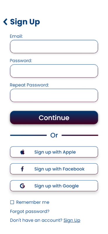
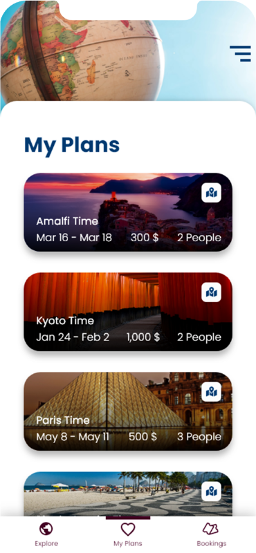
The UI Design:



The Target Audience
• Age range 18 - 35
• They like to travel alone or in small groups
• They google everything for quick answers
• They are getting tired and bored from reading


The App
Travel Time will generate travel itineraries, according to the user's interests.
The Problem
Most of the traveling apps offering the user a lot of information about many attractions, but the user has to build the trip schedule.
Users don't have the patience to read about every location in their trip.
The research, choosing the attractions and planning the schedule, make them bored and tired.
The Solution
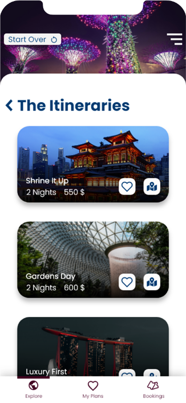
Travel Time will process inputs, and will generate itineraries, that the user will able to choose from.
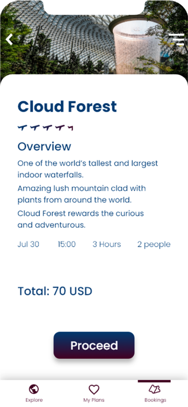
Every attraction will have information, that the user can read.
The user will also be able to edit the itineraries if would like to.
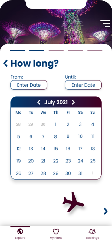
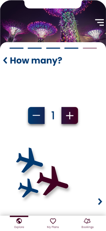
With Travel Time, the user's trip will be ready in just 5 steps:
• Choosing location
• Choosing trip dates
• Choosing the budget limits
• Choosing the number of travelers
• Choosing the travelers interests
The Wireframes
My guiding line for the wireframes was to give the user the maximal information with the minimal thinking required.


Every step of the travel making was separated to different screen.
I chose to put every destination and attraction information inside a photo block.
That way, it will be easier for the user to navigate and to read the app.


The User Flow
Here are some other works
Givatayim Observatory
Branding
Advertising
bottom of page

